Companies change. People change. Trends change. The identity stays.
Technological advancements happen so quickly that we can barely imagine our lives without them. The world of design is constantly changing as well. Many big brands change their logos to give them a fresh new look and show their new strategic brand direction. But changing a company’s logo is still risky and wouldn’t be a good idea without a real purpose behind it. In 2021, Miles changed its logo for the first time since its inception, and two years later, we updated it again when we changed our name. Each time, we started with a careful and deliberate approach with ongoing feedback centered on a specific purpose. We approach all our branding and identity projects similarly to ensure our customer’s vision.History
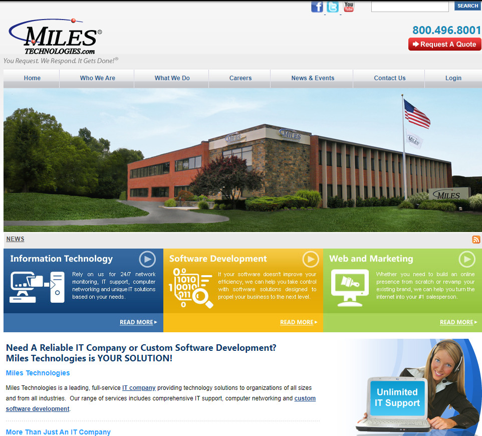
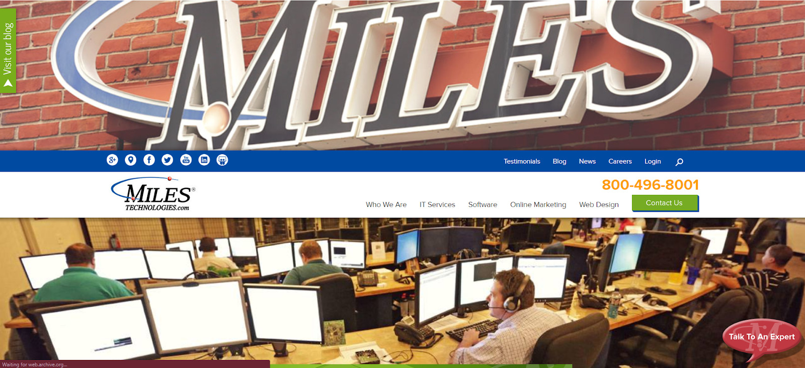
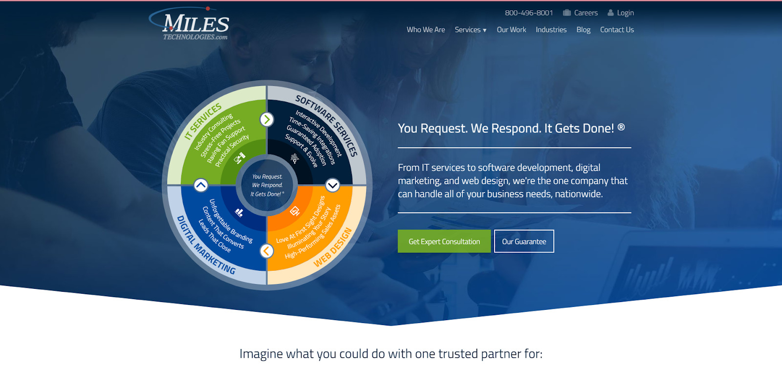
Miles IT was established as a tech company in 1999. Back then, and until very recently, we were known as Miles Technologies. Compared to our website, our logo had yet to be significantly modified. Take a look at some of our previous website designs from the past. 2006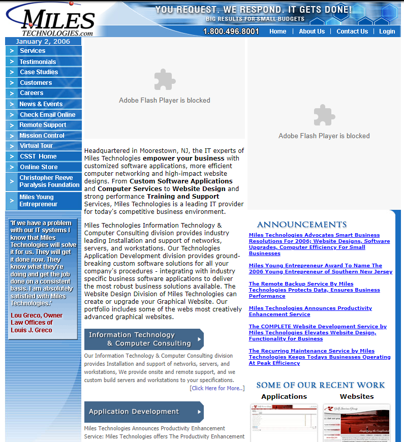 2011
2011
 2014
2014
 2019
2019
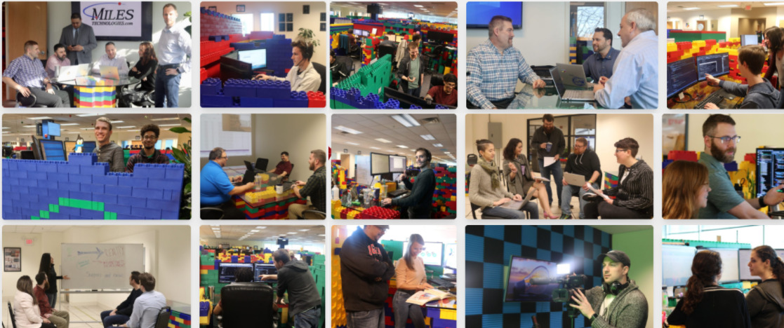
 In 2020, the design team at Miles recognized the vital need for rebranding to emphasize and clearly identify our company culture. Our colored interlocking blocks represent our four primary services, Technology Consulting, IT, Software, and Marketing, and literally “build” our culture without walls. It all started with Chris Miles’ twins building his desk, resulting in a culture-esque headquarters sporting desks entirely constructed with jumbo blocks.
 In April 2020, we launched our new rebranded website that successfully reflected those ideas through every page. Shortly after, we launched our new Brand Library, which contains our new fonts and color guidelines and provides plenty of other valuable assets, such as templates, image galleries, headshots, ads, and other visuals we use on our website and other marketing materials.
So, we redesigned our website, our culture, and our headquarters. We did not forget our logo.
In April 2020, we launched our new rebranded website that successfully reflected those ideas through every page. Shortly after, we launched our new Brand Library, which contains our new fonts and color guidelines and provides plenty of other valuable assets, such as templates, image galleries, headshots, ads, and other visuals we use on our website and other marketing materials.
So, we redesigned our website, our culture, and our headquarters. We did not forget our logo.
Logo Redesign One: “How Do We Improve Our Logo?”
Our Approach
We never just claimed that “we need to change our logo.” We approached it from the perspective, “How can we improve our logo?”. In our initial presentation, we talked about the following:- Fonts: serif vs. sans-serif
- Font decorations: normal vs. bold vs. italic
- Colors
- .com in the logo
- Our identity
How We Gathered Feedback
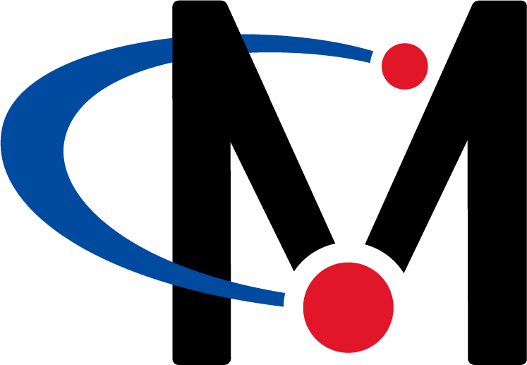
Our logo evolution started with research and ended with numerous surveys, design iterations, and collaborations. Our designers came up with a few new logos to start with. Of course, this was done to gauge our staff’s reaction to the concept of having our logo redesigned. Since we never experienced this change previously, and our logo had been in place for 23 years, we asked our employees to provide feedback via surveys. After we gathered everyone’s feedback, we came up with another round of designs. The major challenge was to improve our logo AND keep our company’s identity in mind. A good number of our staff felt firmly attached to the old logo, while others wanted to embrace new opportunities.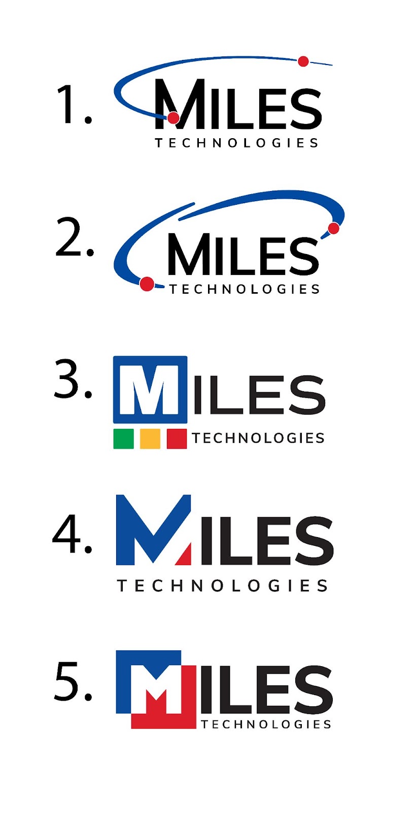
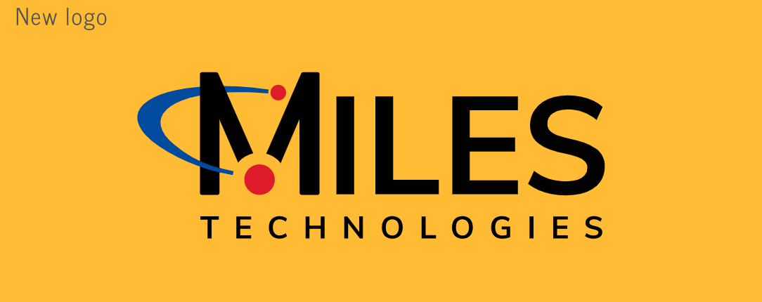
 Ultimately, our Marketing Team created a strong logo that everyone felt confident about.
- First, the new logo was very similar to the old version, yet it was a contemporary reflection of our updated brand. It paid homage to the old design and conveyed many new concepts simultaneously.
- Second, the logo looked modern and up-to-date, just like our technology.
Logo Redesign Two: We Changed Our Name
Our Approach
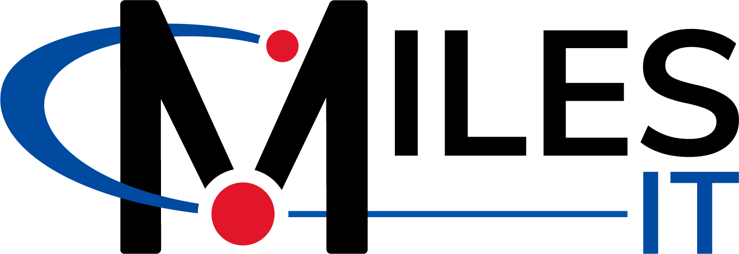
In 2023, Miles Technologies officially changed its name to Miles IT Company, or Miles IT for short. Our name change was a natural evolution of our branding to reflect all the services and ways we can help our customers accomplish more. Our official announcement lets you learn more about the name rebranding and our process. We fell in love with our logo and rebranding two years earlier, but we had a new name, which required a new logo for our website and marketing materials and created a new challenge. We had to ensure that if anyone saw our updated logo on any platform or device, they could instantly know that it was still the same company. Our design team started looking at ways to update our logo without just adding IT and deleting Technologies. They worked closely with our leadership to create and finalize the design with the following guidelines and features.- We wanted the logo to stay as minimal as possible to keep it modern and sleek.
- The M icon from the first rebranding was the most crucial aspect of the logo to retain recognizability for our clients.
- We wanted IT to fit naturally into the logo. To accomplish this, our designers extended the swoop and brought it into IT, creating a genuinely new logo for our new company name.