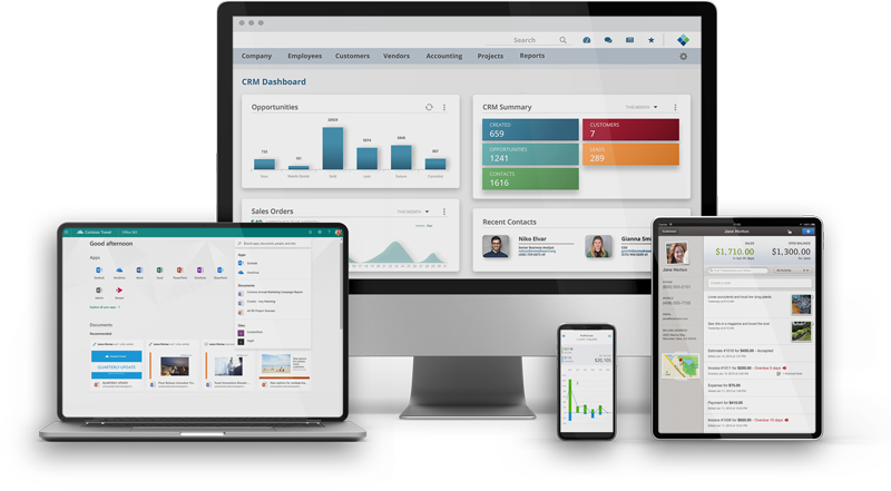
Miles IT recently launched a new Data Warehouse and Business Intelligence Solution using Microsoft Azure and Power BI to create dynamic and interactive data visualizations from multiple data sources to gain critical business insights.
Before launching the Data Warehouse and Business Intelligence Solution, Miles IT used a variety of reporting solutions, including the native report builder in the Striven ERP solution, Dundas Dashboards, Google Data Studio, and various spreadsheets. These solutions supported multiple areas of the organization, including sales pipeline management, resource planning, and project profitability; however, the solutions were limited in their ability to forecast out more than a few weeks and required manual efforts to maintain and view historical trends.
Leveraging our expertise with Azure, Data Warehousing, and Microsoft’s PowerBI seemed a great fit.
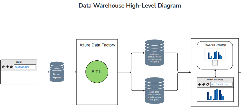
To accomplish this, we had to leverage Striven’s flexible reporting API to capture key data points. From there, we built our ETL using Microsoft’s Data Factory to parse that data and transform them into the Data Marts that would be ready to serve up into PowerBI. Once in PowerBI, the team leveraged the business needs and requirements documents to significantly confirm the key performance indicators (KPIs) that were important to track to shape reports and dashboards.
The solution has already had a significant impact on the ability of our organization to make crucial decisions. This essential information allows us to consider taking action on things like:
- Recruiting: When to grow the team to meet future resource needs
- Resource Assignment: Matching staff skills/strengths/experience to the most appropriate projects and customers
- Process Improvement: Uncover potential bottlenecks resulting from inefficiencies in business processes
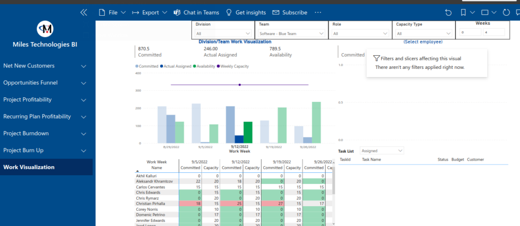
Out of all the benefits we experienced, our Work Visualizer was the most impactful. Dennis Tiu, Vice President of software services, shared,
“I use it mainly right now to look at work planning, and the work visualization has definitely provided value – in terms of being able to see a long-term view of the work plan. This helps in work forecasting and planning.”
With only minor adjustments to our data tracking, we can now extract massive value in instantly getting a snapshot of our project landscape and capacity.
Leveraging data analytics, automated reporting, and visualization has been a game changer for us at Miles, and it is only the beginning. We are in the process of further building out the data warehouse to capture additional data and reports that will include KPIs related to customer satisfaction, timeliness, work in progress (WIP), and more!